Orley Real Estate
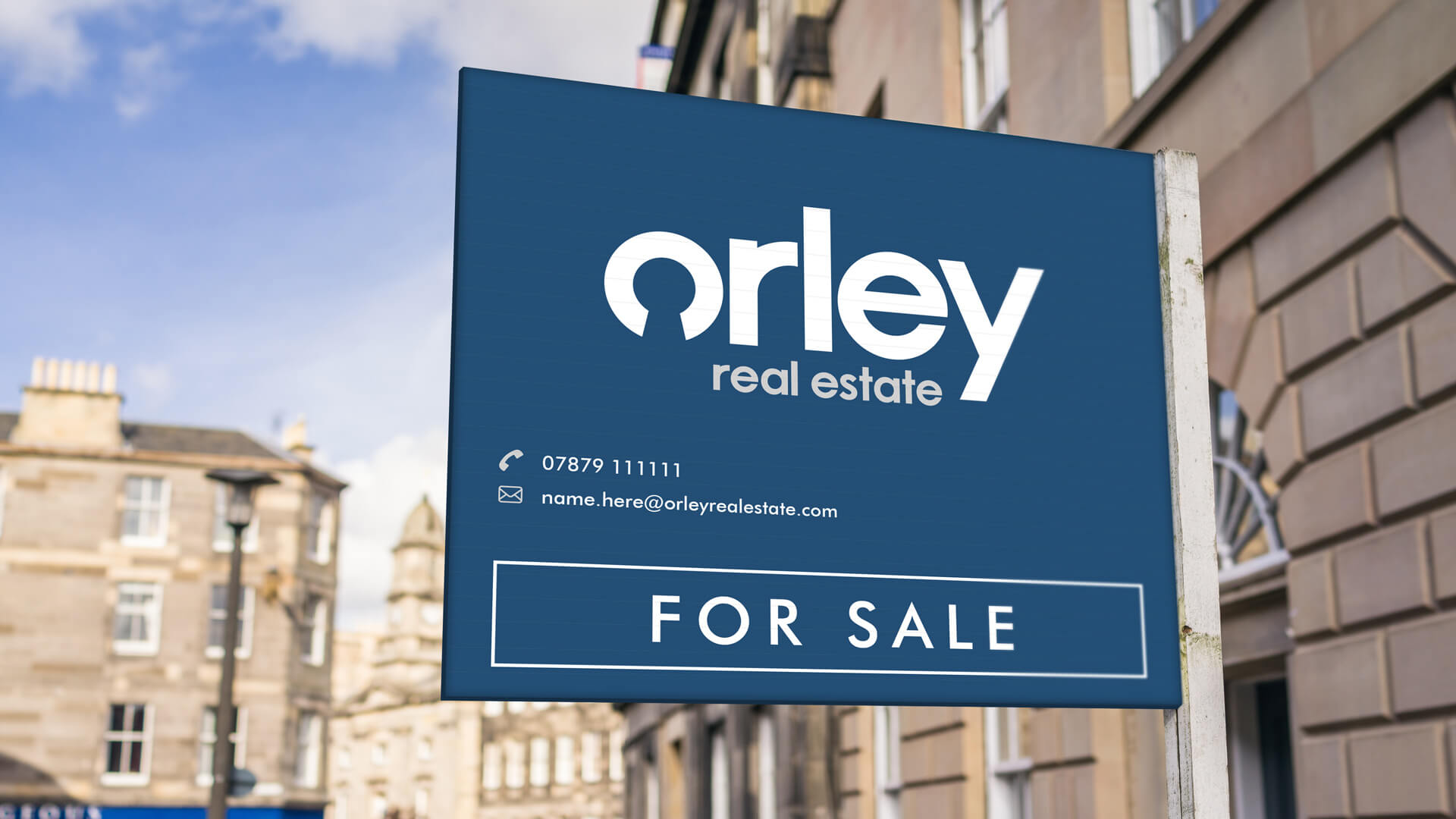
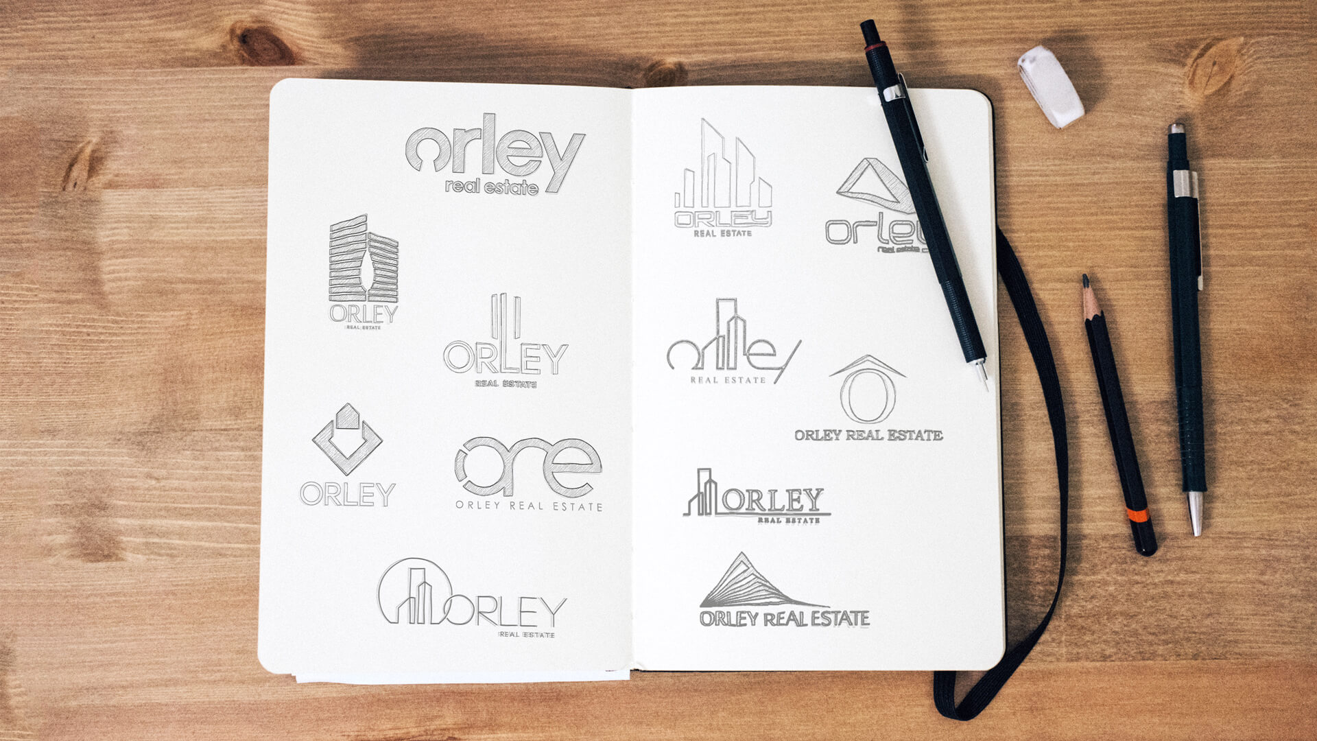
We worked with Orley Real Estate to develop their brand identity. We created a number of potential options before refining the logo into its current form. The use of negative space in the letter ‘o’ was designed to resemble a keyhole, representative of home ownership. Lower case letters were purposefully used to invoke a gentle more approachable perception, which positively encouraged customer engagement with the company. In addition, we created options for branded stationery and mock-ups of potential applications of their new logo. Orley Real Estate were incredibly pleased with the results and the professional manor in which we conducted the work.
Client
Orley Real Estate
Services
“The use of negative space in the letter ‘o’ was designed to resemble a key hole; representative of home ownership”
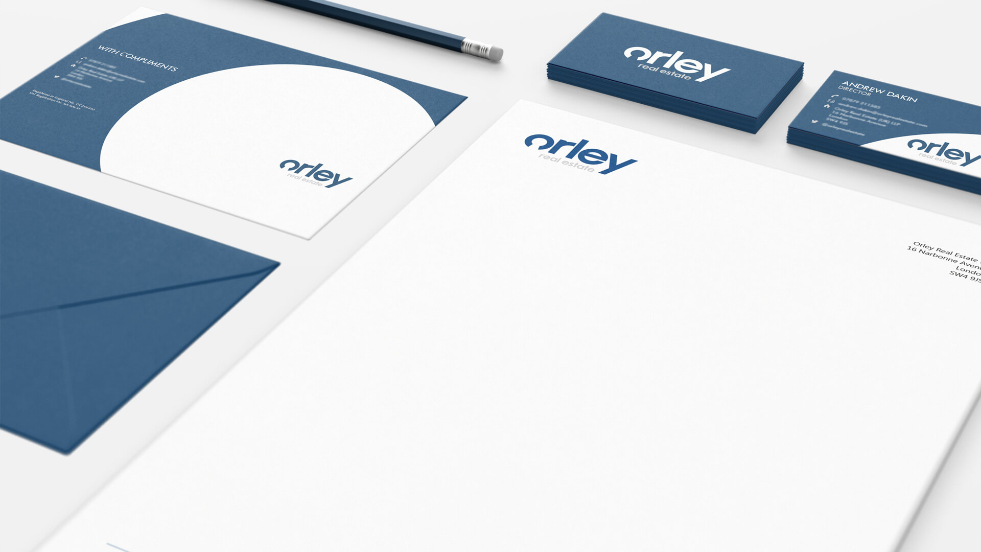
“We created options for stationery and mockups of potential applications of their new logo”