Class Q
We were approached by a local, independent planning and architecture consultancy to breathe new life into their brand and create a suite of business stationary. We were initially briefed to tidy up an existing logo created by our client, but we also provided some additional concepts to give some food for thought. It was one of these new concepts that was developed into the final brand and applied to the client’s website, stationary, marketing materials and pop-up exhibition stand that we were later asked to produce.
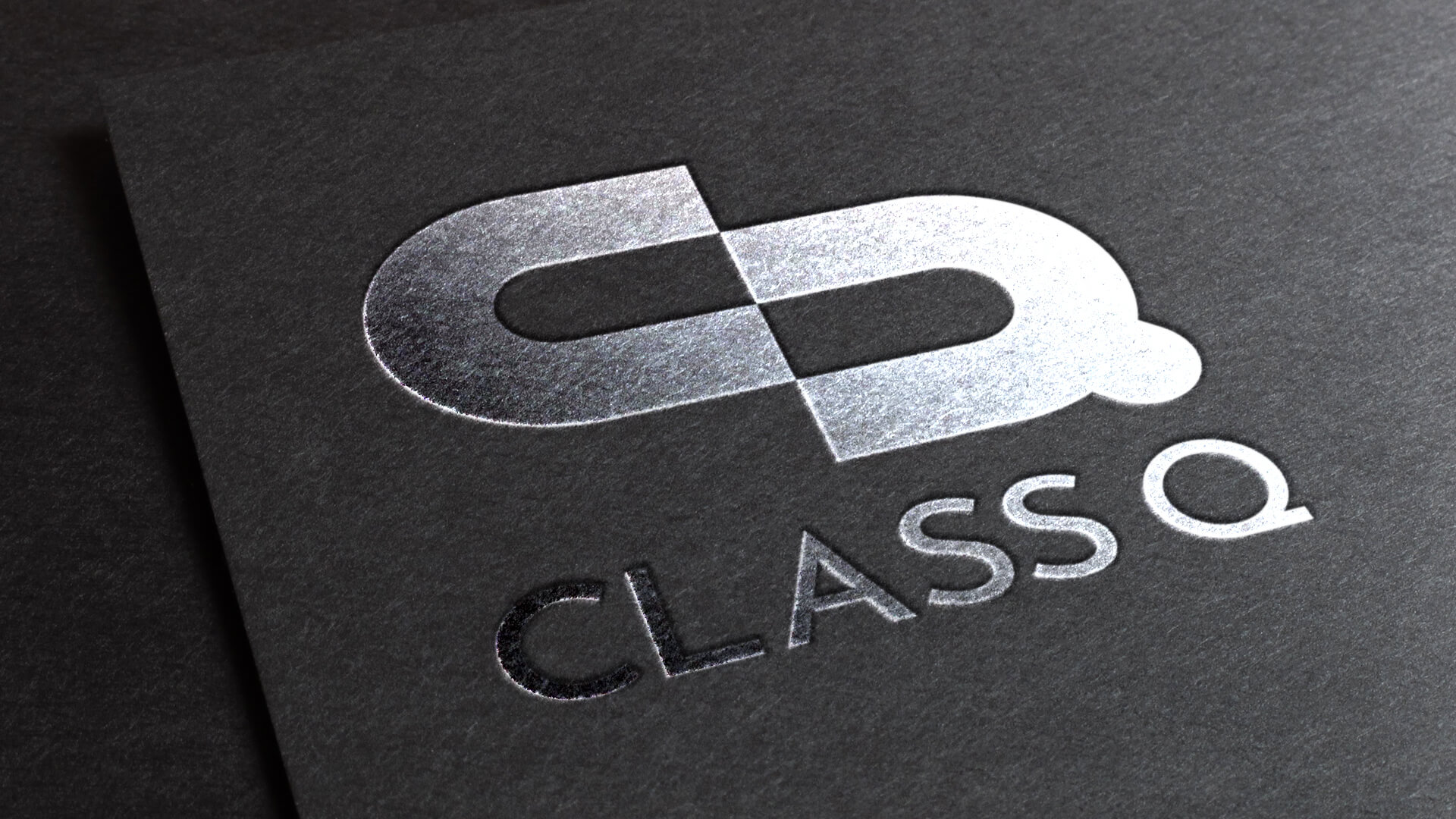
“Class Q’s new brand features a simple, interlocking C and Q referencing the construction industry in which they operate whilst also symbolising strength and integrity”
C 71 M 37 Y 0 K 0
R 41 G 151 B 255
#2997ff
C 100 M 100 Y 100 K 100
R 0 G 0 B 0
#000000