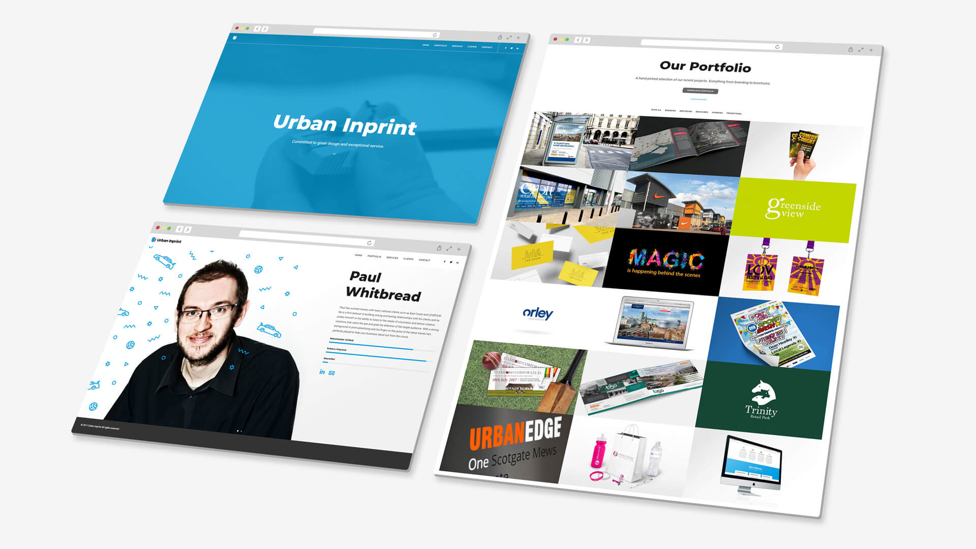
Urban Inprint
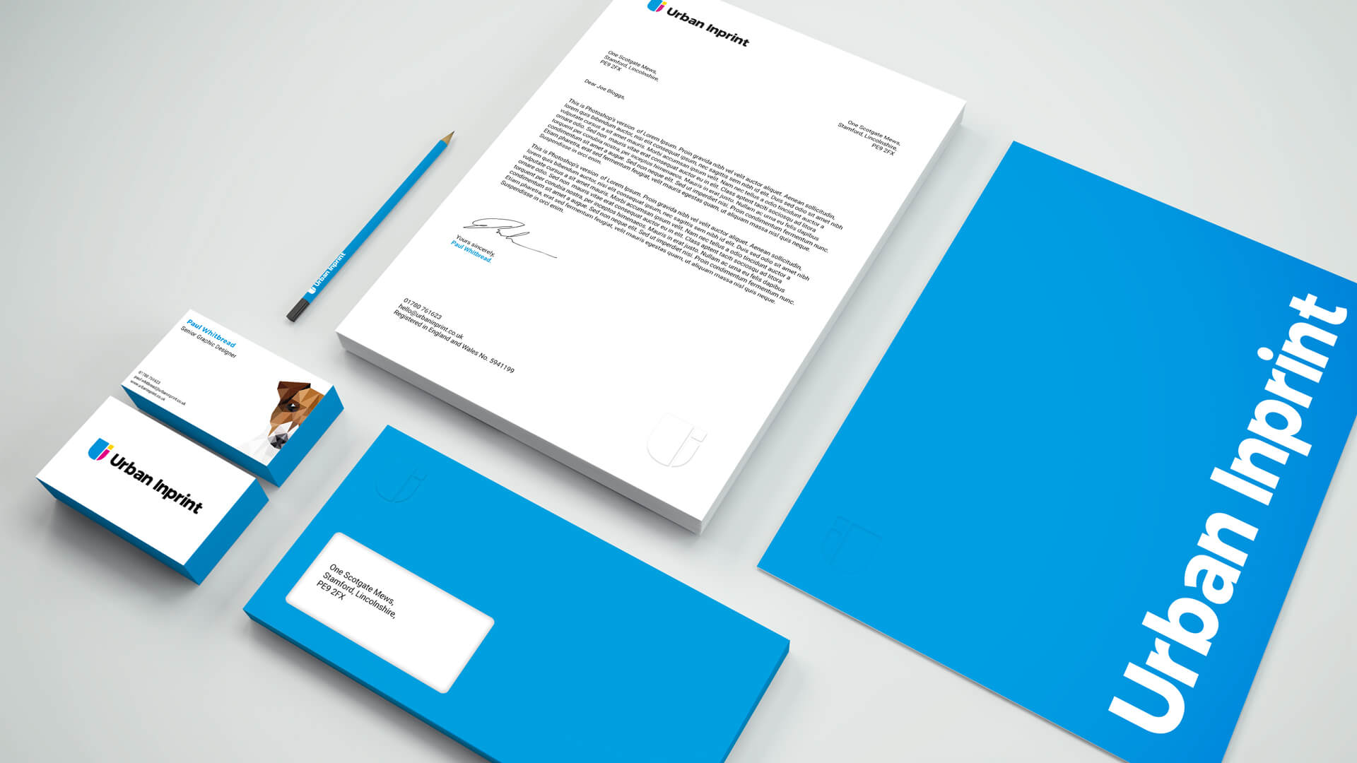
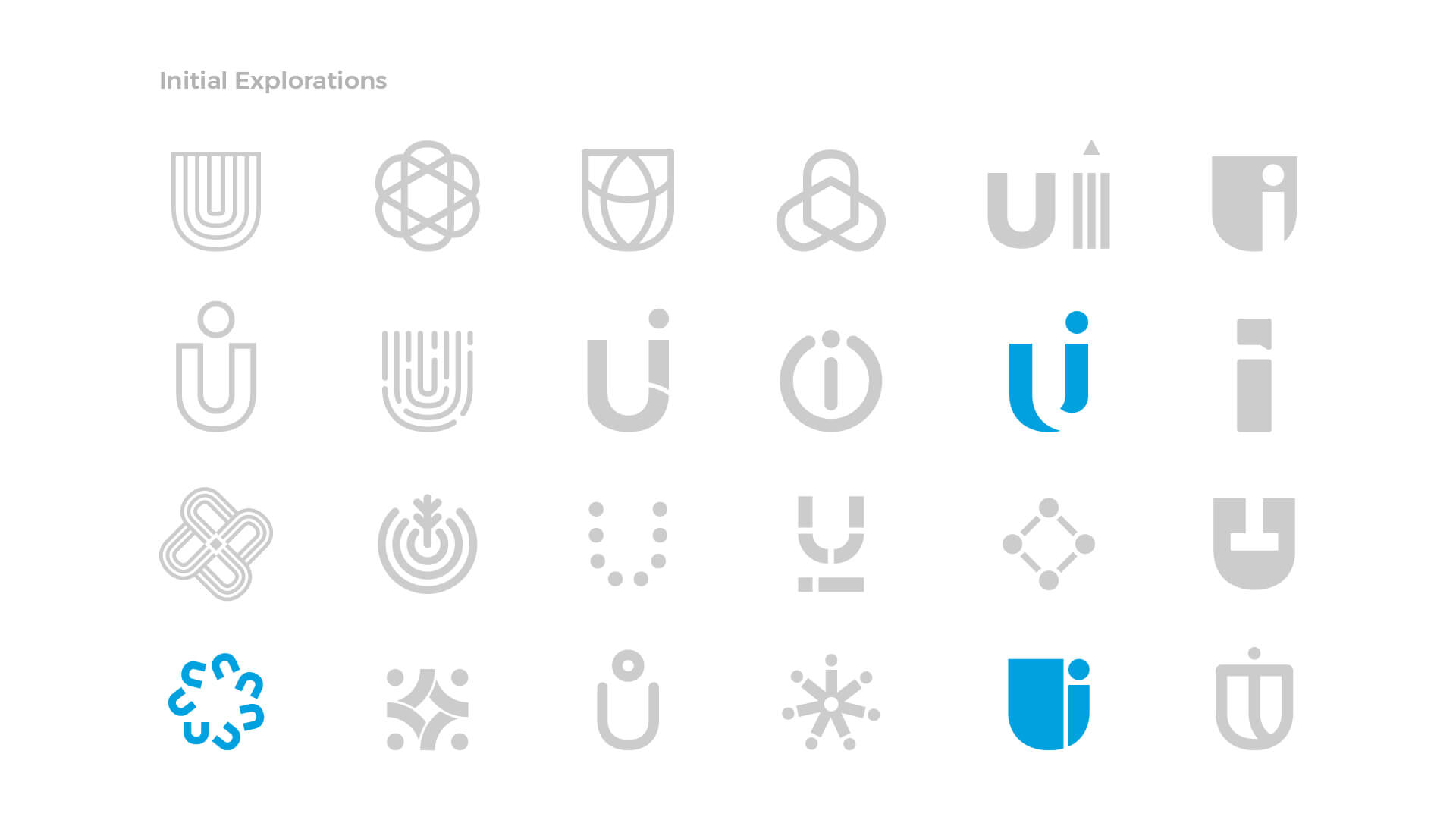
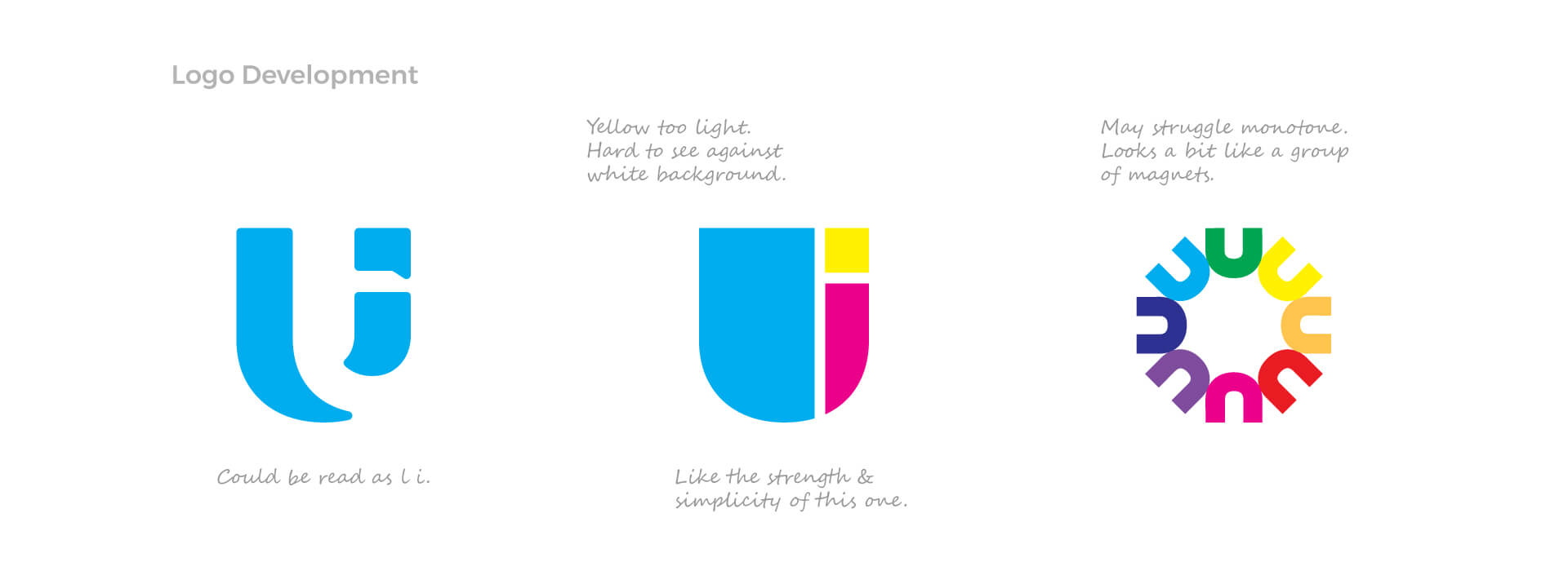
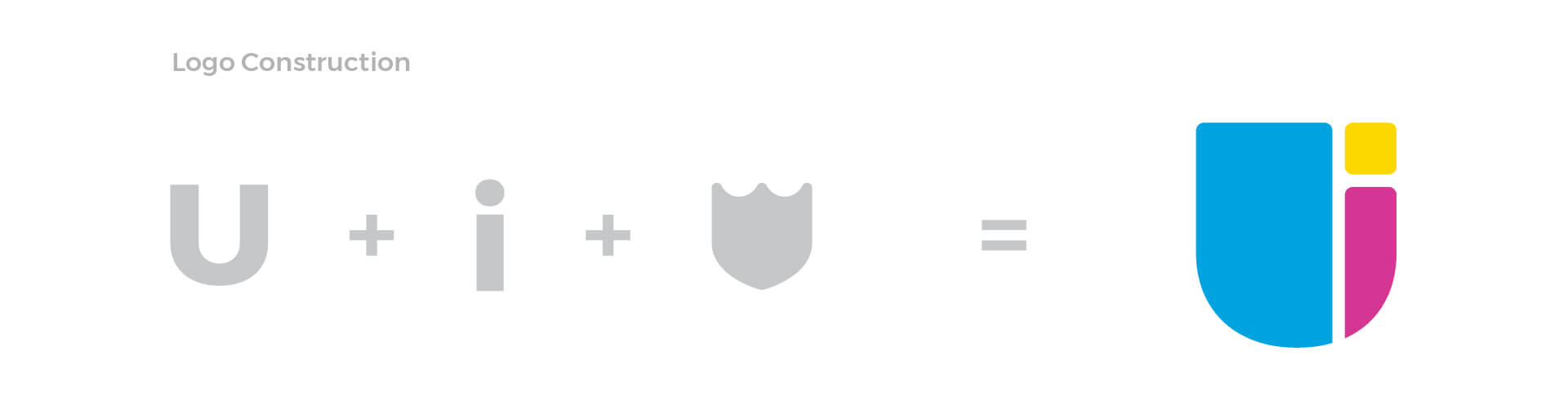
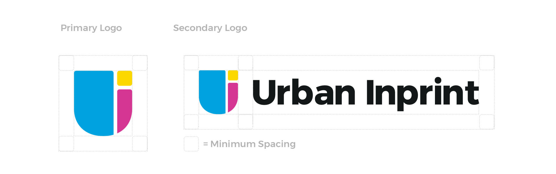
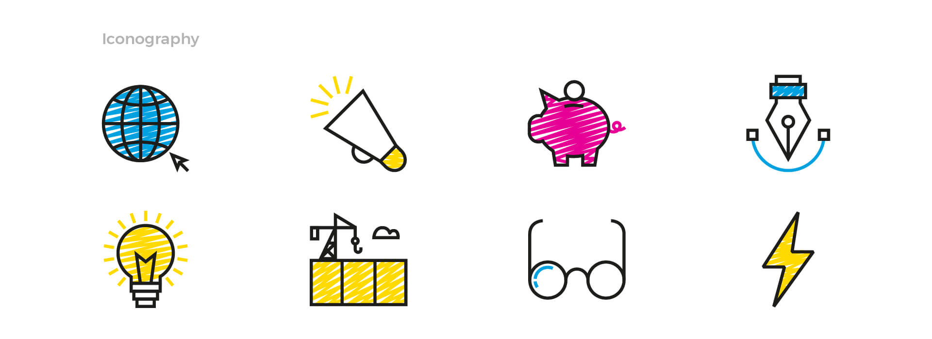
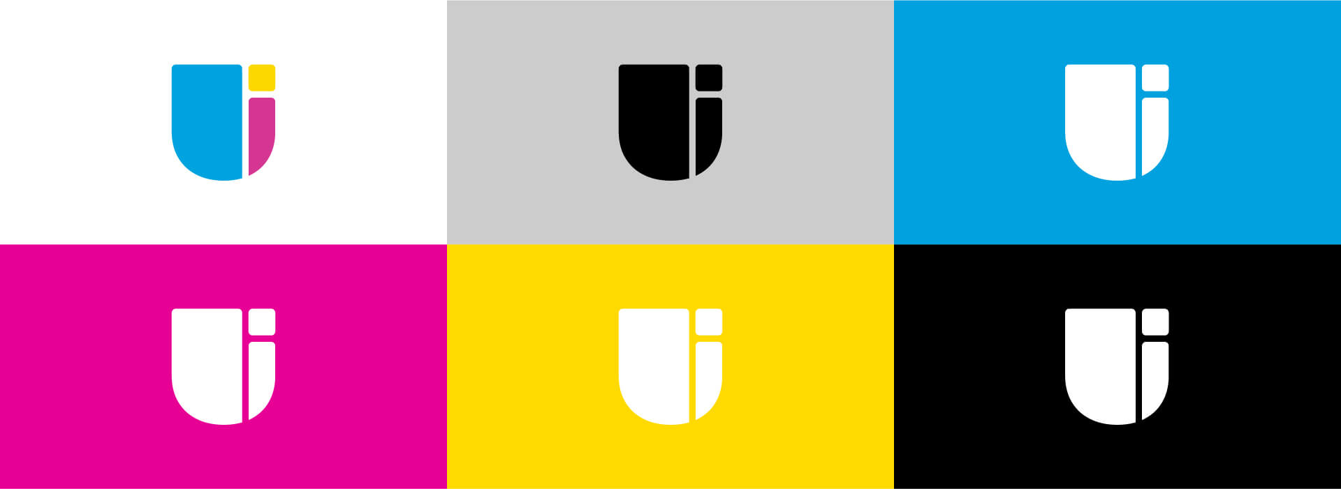
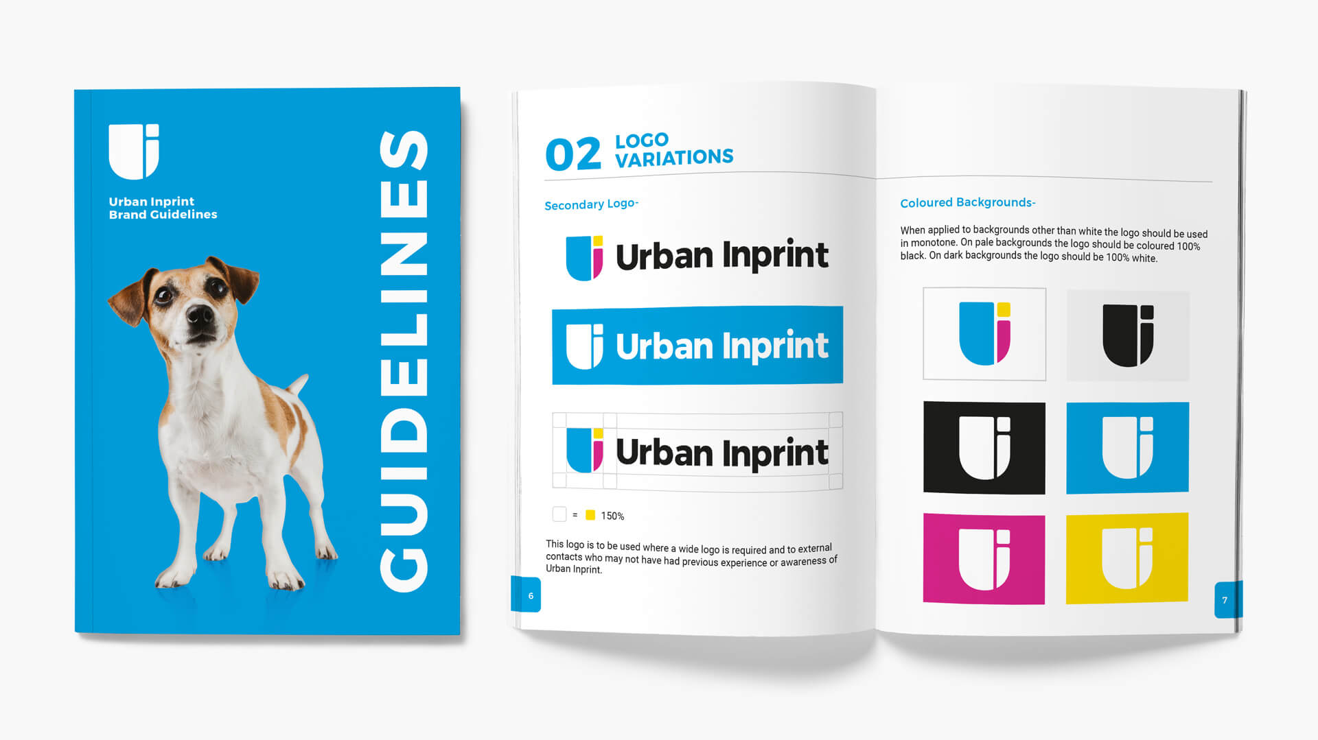
Whilst revamping the Urban Inprint website we thought it was the perfect opportunity to update our logo. The old logo suffered slightly from a lack of contrast between the first and second words. The tightly grouped letters and subtle change in font weight could result in the text reading as one word. The icon was also symbolic of print rollers, which somewhat limits the implied scope of the business as we also design for digital formats. The new symbol is a monogram constructed from an abstract letter U that has been divided to also create the letter i. The overall shape of the logo is reminiscent of a shield which invokes a feeling of security and trust with the company. We chose to use Montserrat Bold as the primary font because of its modern, creative character that invokes our brand ideology.
Client
Urban Inprint
Services
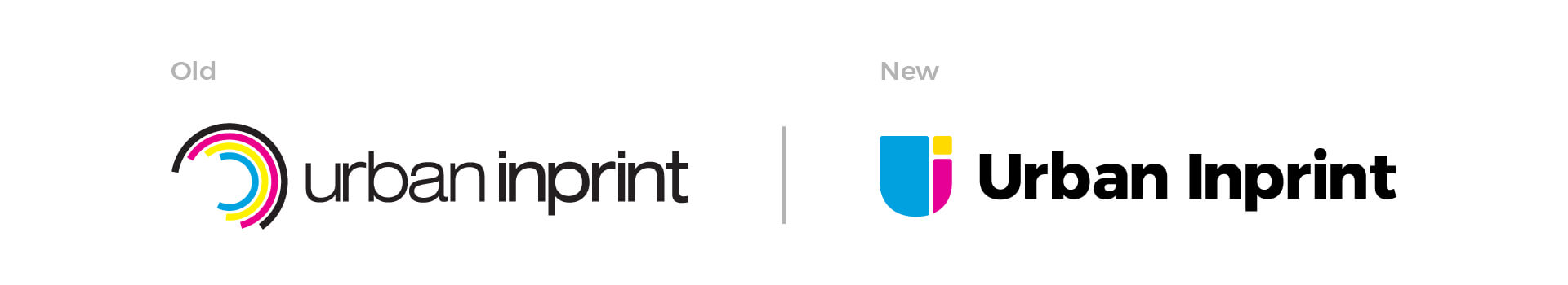
“The overall shape of the logo is reminiscent of a shield which invokes a feeling of security and trust with the company”
Pantone 229C
C 80 M 15 Y 0 K 0
R 0 G 160 B 223
#00A0DF
Pantone Rhodamine Red C
C 11 M 92 Y 0 K 0
R 231 G 0 B 148
#E70094
Pantone Medium Yellow C
C 2 M 11 Y 100 K 0
R 255 G 217 B 0
# FFD900
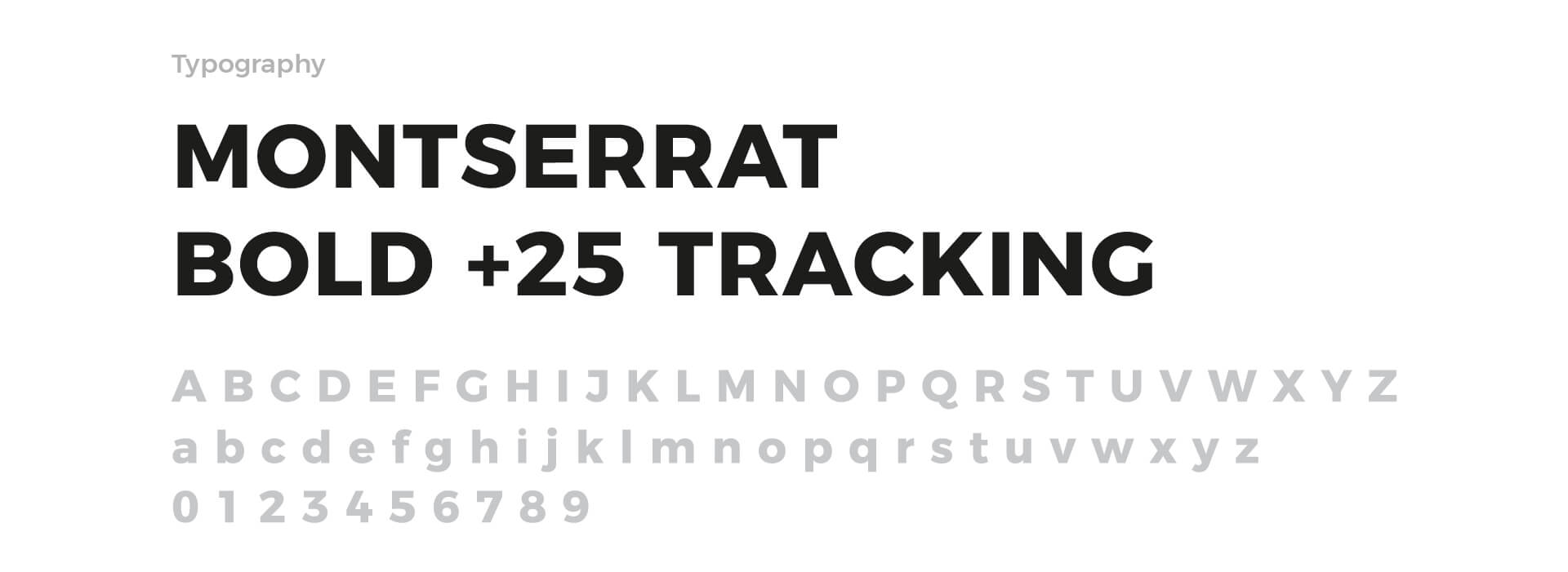
“We chose to use Montserrat Bold as the primary font because of its modern, creative character that invokes our brand ideology”
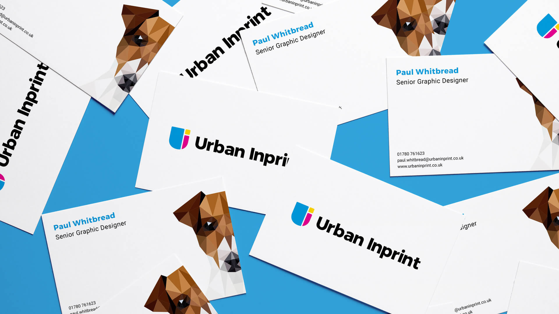
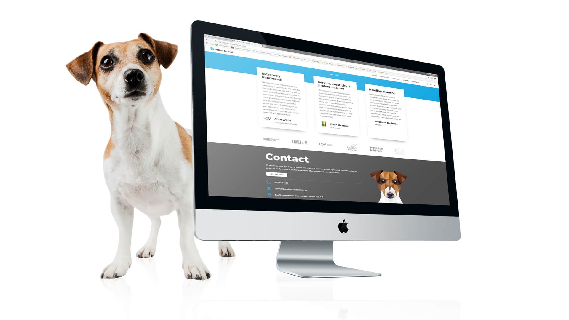
“From meetings with our clients we discovered that one of the things that really stuck with them was the Urban Inprint dog. So we decided to adopt him as our official mascot”