T150, Thetford
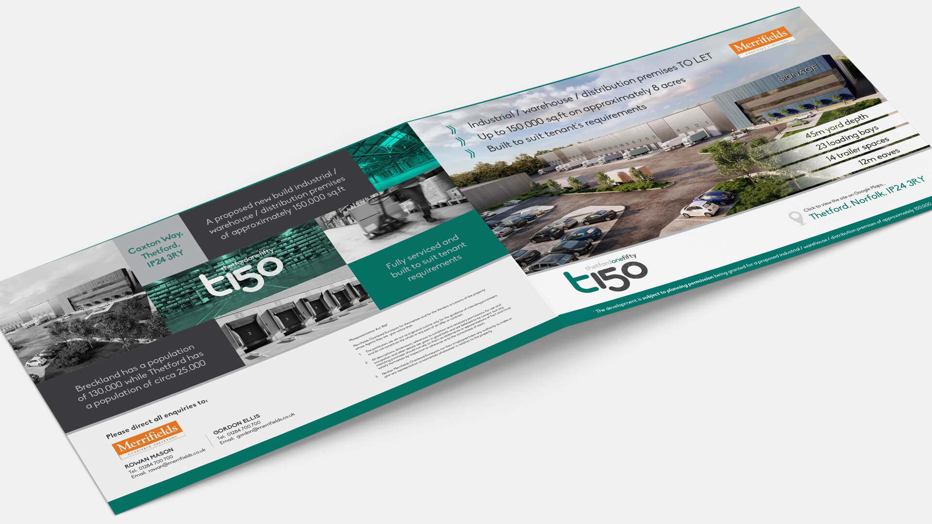
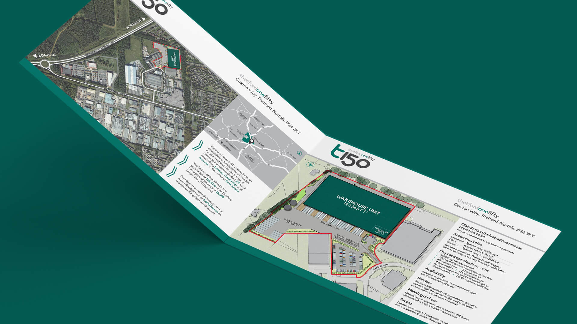
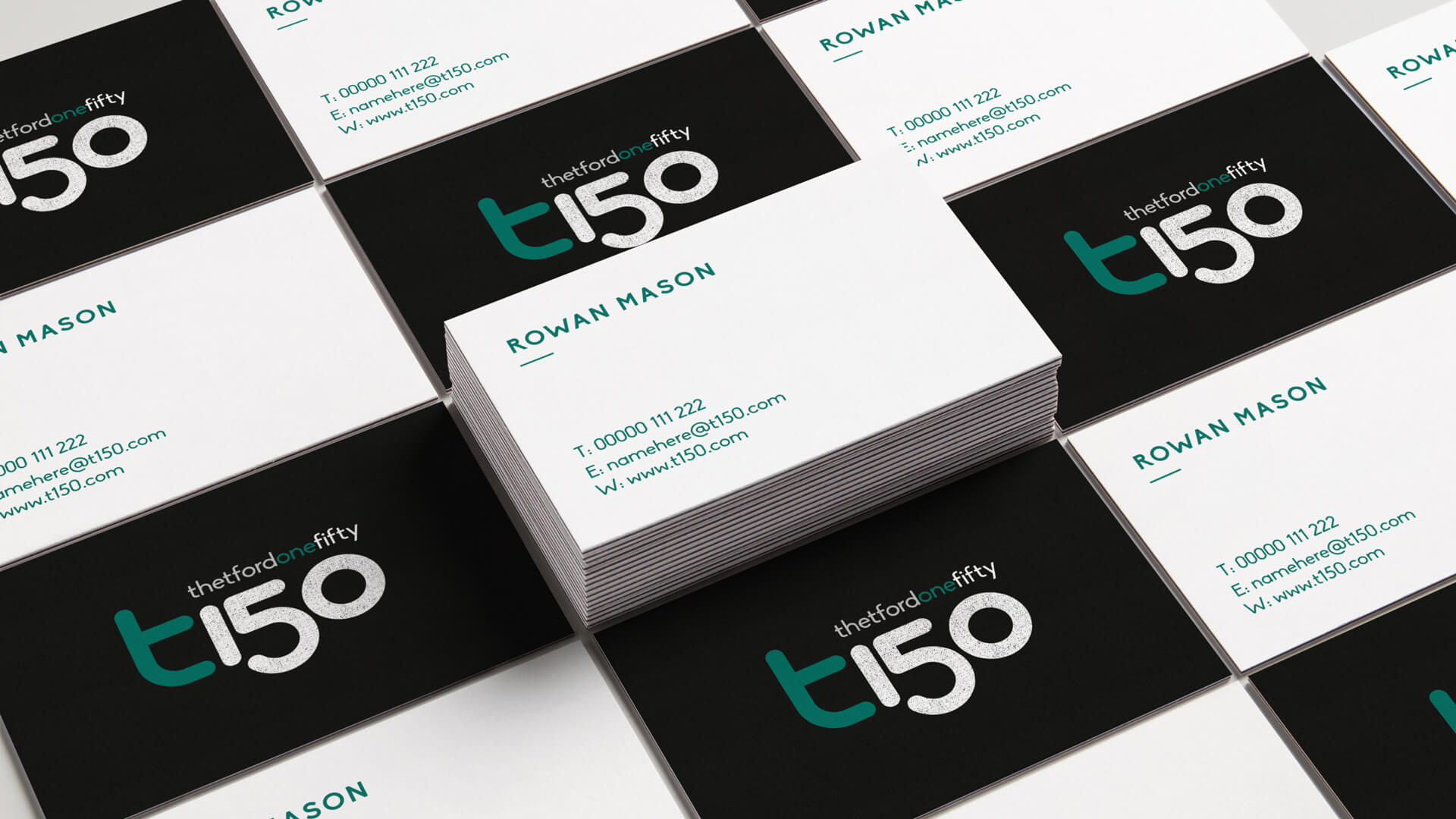
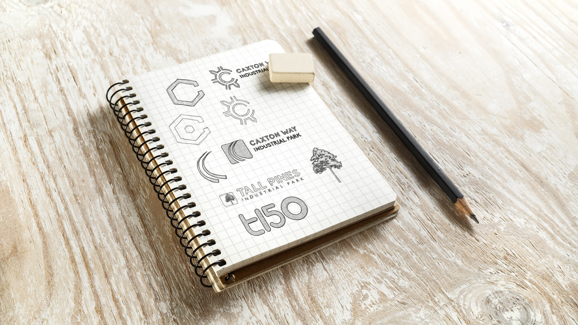
We were approached by Merrifields to design a marketing brochure for T150, Thetford. The brief required us to create a logo for the park and design an attractive document that would help sell the potential development to a tenant. T150 was the name we agreed upon, after a few other rejected concepts. The T standing for Thetford and the 150 being a reference to the proposed warehousing space of 150,000 sq.ft. We used a geometric font combined with an asphalt texture to reflect the modern, industrial nature of the park. The main function of the brochure was to emphasize the developments strategic potential, as the site is ideally located adjacent to the A11 trunk road. To this end we created a number of custom maps showing the developments prime location.
Client
Services
“We used a geometric font combined with an asphalt texture to reflect the modern, industrial nature of the park”